Reading a crypto chart starts with one shape repeated thousands of times: the candlestick. Once you understand what a single candle actually shows, most of what feels intimidating about a chart — the zigzag lines, the colored bars underneath, the moving averages weaving through the price — turns out to be a handful of simple ideas stacked on top of that one shape. This page walks through the actual reading order that works: candles first, then trend and levels, then volume, then the two indicators worth learning before any others. Once you can read a chart on your own, a cryptoscreener becomes genuinely useful too — it filters thousands of charts down to the ones matching the conditions you now know how to read, rather than requiring you to check each one by hand. Nothing here is trading advice or a signal to act on; it’s a description of what a chart is actually showing.
What a single candlestick actually shows
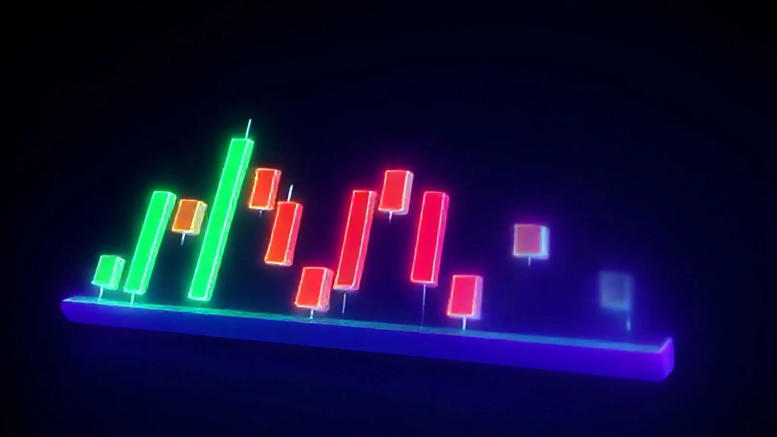
Every candlestick on a crypto chart records four prices for one period of time — the open, the high, the low, and the close. The thick part of the candle, called the body, spans between the open and the close. If the close is higher than the open, the body is usually shown in green or white: buyers were in control during that period. If the close is lower than the open, the body is usually red or black: sellers were in control.
The thin lines above and below the body are called wicks, or shadows. They show the full range price traveled during that period, even the parts it didn’t hold onto. A long upper wick means price was pushed up and then rejected back down before the period closed — buyers tried to push higher and failed. A long lower wick means the opposite: price was pushed down and bought back up before the close. A candle with almost no wicks at all means price moved in mostly one direction for that entire period without much pushback.
The most important habit before reading anything into a candle’s shape: check what timeframe you’re actually looking at. A single candle on a 1-hour chart represents one hour of trading. The same asset’s daily chart compresses an entire day into one candle. The exact same price action can look completely different depending on which timeframe is selected, and a pattern that looks significant on a 5-minute chart may be noise that disappears entirely on a daily chart. Individual candles also combine into recognizable candlestick patterns — short sequences worth learning once the basic anatomy above makes sense.
Reading trend, support, and resistance
Before looking at any single candle in isolation, it helps to step back and ask a simpler question: is price generally moving up, moving down, or moving sideways within a range? A trend isn’t a straight line — it’s a series of higher highs and higher lows (uptrend) or lower highs and lower lows (downtrend). Zooming out to see the last several dozen candles, rather than staring at the most recent one, is usually the fastest way to answer this.
Support and resistance are price zones where an asset has historically struggled to fall below (support) or rise above (resistance). They’re rarely exact lines — price often overshoots a zone slightly before reversing, so it’s more useful to think of a band a few percent wide than a single price point. A level becomes more significant the more times price has approached it and reversed; a level that’s only been tested once is a weaker signal than one that’s held three or four times.

Why volume matters more than most beginners think
Volume — usually shown as bars along the bottom of a chart — measures how much of the asset actually changed hands during each period. It matters because it tells you whether a price move reflects real participation or just a handful of trades in a thin market. A price breakout above a resistance level on unusually high volume is generally read as more meaningful than the exact same breakout on quiet, below-average volume, because the high-volume version reflects broader agreement that the move is real. Waiting for volume confirmation before trusting an apparent breakout is a standard habit, not an optional extra — a lot of false breakouts happen on low volume and reverse just as quickly as they appeared.
Two indicators worth learning first
Crypto charting platforms offer dozens of indicators, and it’s tempting to stack several onto a chart at once. In practice, two cover most of what a beginner actually needs, and learning them well is more useful than skimming ten.
Moving averages smooth out price over a chosen number of periods to show the underlying trend direction with less noise from candle-to-candle swings. The 50-period and 200-period moving averages are commonly referenced for a longer-term trend read — when the shorter average crosses above the longer one, it’s often read as a bullish signal (and the reverse for bearish), though a crossover confirms a trend that’s often already underway rather than predicting one about to start.
RSI (Relative Strength Index) is an oscillator, typically calculated over 14 periods, that measures the speed and size of recent price changes on a scale from 0 to 100. Readings above 70 are conventionally read as overbought, and below 30 as oversold — not as a guarantee that price will reverse immediately, but as a signal that the recent move has been unusually fast in one direction. RSI crossing above or below its own 50 midline is sometimes read as a shift in short-term momentum.
What a chart can’t tell you
A chart describes what has already happened and the market’s current structure — it does not predict what will happen next with any certainty. Every indicator described above gives false signals sometimes, and crypto markets in particular can move on news, liquidity conditions, or large single trades that no amount of chart reading would have anticipated. Reading a chart well means understanding what’s currently happening more clearly, not gaining a forecasting tool that removes risk.
A worked example: reading one chart start to finish
Putting the pieces together in order helps more than reading them as a list. Say you pull up an asset’s daily chart. First, confirm the timeframe — this is one candle per day, so a pattern here reflects days of activity, not minutes. Next, zoom out to see the last few months: is price generally climbing, falling, or moving sideways in a range? Suppose it’s been climbing for several weeks with higher highs and higher lows — that’s an uptrend.
Now locate the nearest resistance zone above the current price — a level price has approached and reversed from at least twice before. And the nearest support zone below — where it’s bounced before. These two zones frame what a break in either direction would mean. Check the moving averages: if the 50-period average is above the 200-period average and both are sloping upward, that’s consistent with the uptrend already identified from the candles alone — a second, independent confirmation rather than a new signal.
Check RSI: if it’s sitting around 65, the trend has momentum but isn’t yet in extreme overbought territory. If it were above 80, that would be worth noting as an unusually fast move, though not an automatic reason to expect an immediate reversal. Finally, look at volume on the most recent strong up-day — if it’s noticeably above the recent average, that adds weight to the move being genuine rather than a low-participation drift. None of these five checks alone tells the full story; reading them together is what makes chart reading a skill rather than a lookup table.
Common mistakes beginners make
- Reading one candle in isolation. A single candle’s shape means far less without the surrounding trend and timeframe for context.
- Ignoring volume entirely. A price move with no volume behind it is weaker evidence than the same move on strong volume, and treating them the same leads to false conclusions.
- Treating overbought/oversold as an automatic trigger. RSI above 70 describes fast recent momentum, not a guaranteed reversal — in a strong trend it can stay elevated for a long stretch.
- Only checking one timeframe. A pattern that looks significant on a 15-minute chart can be meaningless noise on the daily chart of the same asset.
- Treating a support/resistance level as an exact price. These are zones, not lines — expecting a reversal at one precise number leads to disappointment when price overshoots slightly before turning.
How to evaluate any chart before acting on it
- Confirm the timeframe. Make sure the pattern you’re looking at holds on more than one timeframe before treating it as significant.
- Identify the trend. Zoom out far enough to see whether price is trending or ranging before reading into any single candle.
- Locate the nearest support/resistance zones. Know what price level would need to break for the current read to change.
- Check volume. A move without volume behind it is weaker evidence than the same move with it.
- Cross-check with RSI or a moving average. Use a second, independent signal rather than relying on one read alone.